SimpleUI for Android mode: download: Dropbox
He creado esta interfaz grafica para Processing/Android con la ayuda de Gemini, la IA de Google.
A disfrutarla comunidad!!
SimpleUI for Android mode: download: Dropbox
He creado esta interfaz grafica para Processing/Android con la ayuda de Gemini, la IA de Google.
A disfrutarla comunidad!!
Library updated!
SimpleUI is a lightweight, touch-optimized graphical user interface library specifically designed for Processing’s Android mode. It features a responsive scrolling system, automatic scaling, and a dark/light mode engine.
The library operates on a Global Scaling System and a Target-based Scrolling Engine.
Scaling: Elements are designed on a virtual coordinate system (e.g., 350px wide) and automatically scaled to fit the physical screen.
Scrolling: Uses a lerp() (Linear Interpolation) function for smooth momentum-based scrolling.
Z-Order: Dropdowns are automatically rendered in a separate pass to ensure they appear above all other elements.
initUI(String fontName)Initializes the UI system, sets the font, and defaults to Light Mode.
initUI("SansSerif");fitToWidth(float designWidth, float screenPercentage)Calculates the uiScale based on the device width.
designWidth: The coordinate system width you are designing for.
screenPercentage: (0.0 - 1.0) How much of the screen width the UI should occupy.
setDarkMode(boolean active)Toggles the global color palette between high-contrast dark and light modes.
UILabelStatic text display for titles or information.
Java
new UILabel(String id, int x, int y, int w, int h, String text, int fontSize)
UIButtonA rounded-corner button with visual feedback when pressed.
Java
new UIButton(String id, int x, int y, int w, int h, String label, int fontSize)
UICheckboxA binary toggle switch with an associated label.
Java
new UICheckbox(String id, int x, int y, int size, String label, int fontSize)
UISliderA horizontal bar for selecting numeric values within a range. Optimized for touch dragging.
Java
new UISlider(String id, int x, int y, int w, int h, float min, float max, int fontSize)
UIDropdownA pick-list that expands vertically. It features an “Overlap-Z” logic to prevent being hidden by elements below it.
Java
new UIDropdown(String id, int x, int y, int w, int h, String[] options, int fontSize)
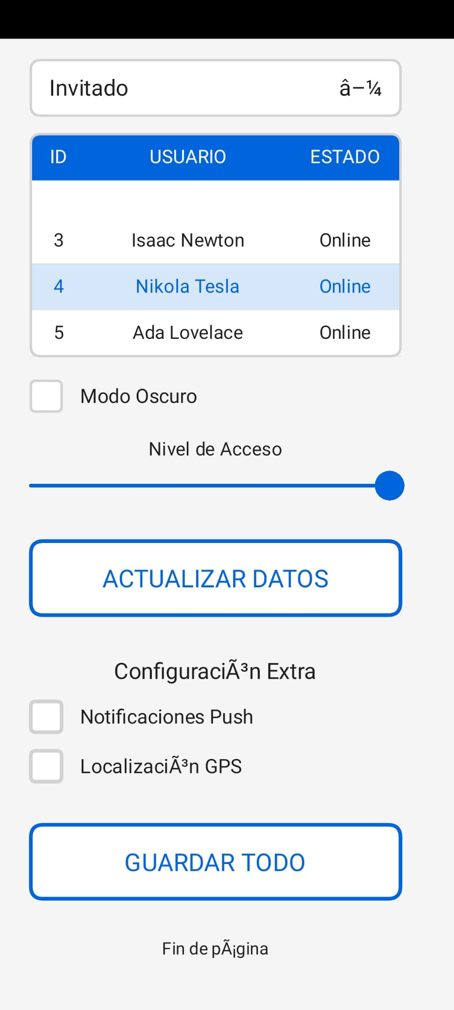
UITableA complex data grid featuring internal scrolling and row selection. Note: Does not use canvas.clip(), making it 100% compatible with Android 9+ hardware acceleration.
Java
new UITable(String id, int x, int y, int w, int h, String[] headers, float[] colWidths, int fontSize)
To ensure the UI remains responsive while the page is scrolling, the library uses a lockGlobalScroll system.
You must link the following handlers in your main tab:
Java
void mousePressed() { handleUIMousePressed(); }
void mouseDragged() { handleUIMouseDragged(); }
void mouseReleased() { handleUIMouseReleased(); }
Selection vs. Scroll: If a user touches a control (Button, Slider, Table), lockGlobalScroll is set to true, preventing the page from moving while the user interacts with the control.
Threshold: A 10-pixel movement threshold is used to differentiate between an intentional click and a scroll gesture.
| Variable | Description | Light Mode | Dark Mode |
|---|---|---|---|
uiAccentColor |
Primary Action Color | Blue (#0064DC) | Light Blue (#008CFF) |
uiBgColor |
Main Background | Off-White (#F5F5F5) | Dark Grey (#191919) |
uiSurfaceColor |
Control Background | White (#FFFFFF) | Grey (#2D2D2D) |
uiTextColor |
Main Typography | Charcoal (#1E1E1E) | White (#F0F0F0) |
Very nice. I particularly like the fact that the same code will run on devices of different sizes. I used to have to write code specifically for each device that I wanted to run it on. I tested the following demo on both the phone emulator in Processing and an actual tablet device (Samsung S2); the code scaled appropriately to run on the tablet.
UISlider slider;

void setup() {
  fullScreen();
  orientation(PORTRAIT);
  fitToWidth(350, 0.95);
  slider = new UISlider("", 25, 40, 300, 30, 0, 100, 10);
  addUIElement(slider);
}

void draw() {
  background(255, 255, 255);
  fill(0, 0, 255);
  circle(width/2, height/2, slider.value*10);
  updateAndDrawUI();
}

void mousePressed() {
  handleUIMousePressed();
}

void mouseDragged() {
  handleUIMouseDragged();
}

void mouseReleased() {
  handleUIMouseReleased();
}

void keyPressed() {
  handleUIKeyPressed();
}
Output:
We need a color picker UIElement to allow the user to change the color of the big dot.
All in all it is a nice contribution to Android development in Processing, which now works again in v.4.4.10. Thanks to everyone who made this possible and to the author for this addition.
ControlP5 has a colorWheel which works ok in Android mode:
import controlP5.*;

ControlP5 cp5;
UISlider slider;

int c = color(0);

void setup() {
  fullScreen();
  orientation(PORTRAIT);
  cp5 = new ControlP5(this);
  cp5.addColorWheel("c" , 50 , 10 , 300 ).setRGB(color(64,124,188));
  fitToWidth(350, 0.95);
  slider = new UISlider("slider",175, 40, 160, 30, 0, 1000, 250);
  addUIElement(slider);
}

void draw() {
  background(255, 255, 255);
  fill(c);
  circle(width/2, height/2, slider.value);
  updateAndDrawUI();
}

void mousePressed() {
  handleUIMousePressed();
}

void mouseDragged() {
  handleUIMouseDragged();
}

void mouseReleased() {
  handleUIMouseReleased();
}

void keyPressed() {
  handleUIKeyPressed();
}
Output:
N.B.
I changed the last parameter of the slider in the library as follows:
       // this.value = (max+min)/2;
        this.value = s;
Usually slider controls have three parameters: min, max, value.
DOWNLOAD LIB + EXAMPLE! for Android.
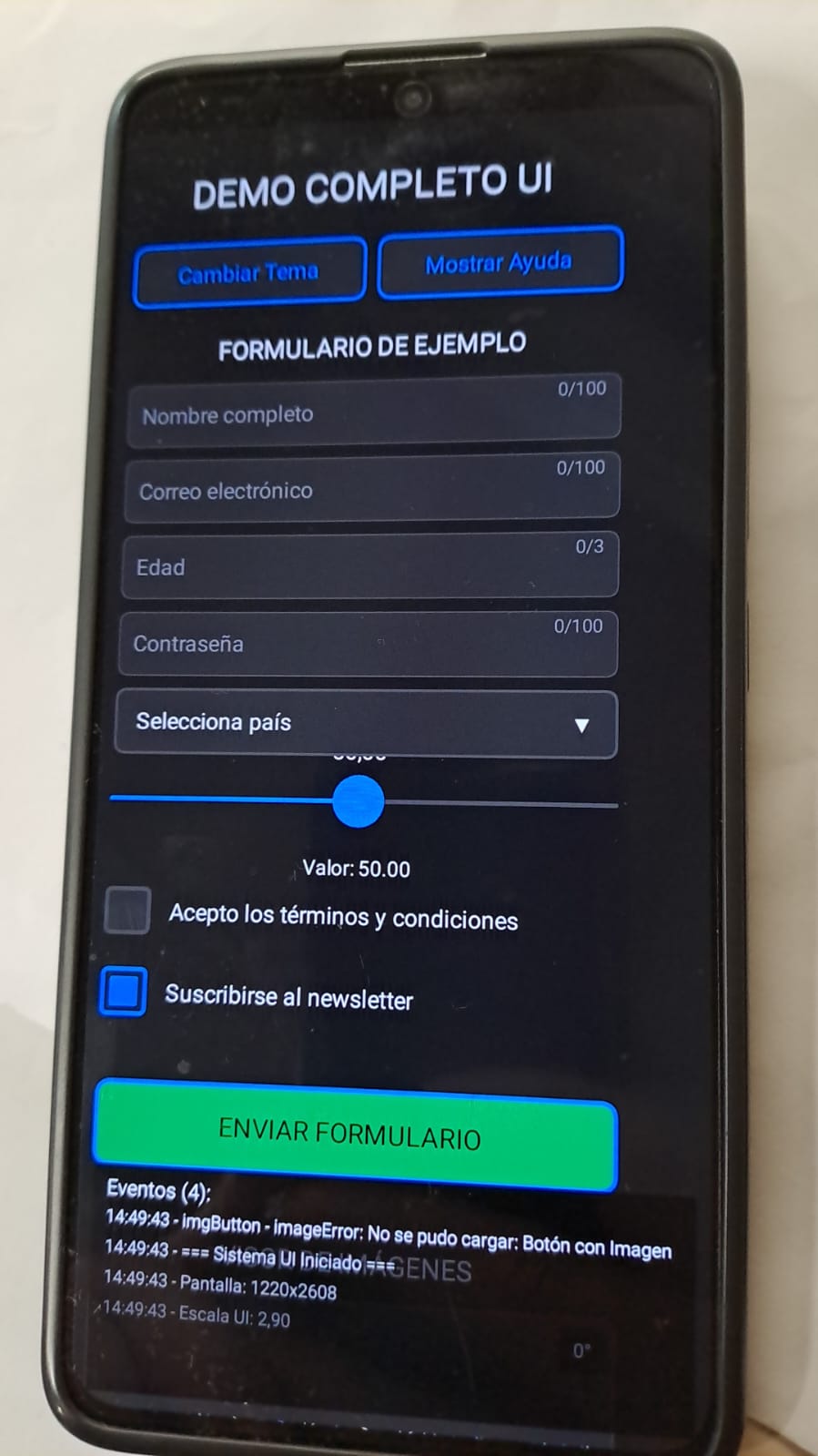
Campos de texto (normal, email, numérico, contraseña)
Dropdowns con menús desplegables
Sliders con valores ajustables
Checkboxes con estados
Validación básica de campos
UIImageView: Visor de imágenes con:
4 modos de ajuste (Contener, Cubrir, Rellenar, Original)
Rotación en 4 direcciones (0°, 90°, 180°, 270°)
Controles para cambiar modo y rotar
Restablecimiento a estado original
UITable: Tabla de datos con:
Scroll interno
Selección de filas
Añadir/eliminar datos dinámicamente
UIImageButton: Botones con imágenes
Consola que muestra todos los eventos UI
Logging con timestamp
Límite de entradas para evitar sobrecarga
Cambio entre tema claro/oscuro
Botones con colores personalizados
Escalado responsive para diferentes pantallas
Scroll global con indicador visual
Overlay de ayuda interactivo
Deshabilitar/habilitar todos los elementos
Manejo de teclado virtual en Android
Sistema de capas para dropdowns
Escalado automático según ancho de pantalla
Scroll suave con lerp
Gestión de z-index para elementos superpuestos
Manejo correcto de clics y arrastres
Ejecuta el sketch en modo Android
Toca “Mostrar Ayuda” para ver todas las funcionalidades
Interactúa con cada componente:
Escribe en los campos de texto
Abre dropdowns y selecciona opciones
Desliza los sliders
Marca/desmarca checkboxes
Cambia el modo y rota la imagen
Añade filas a la tabla
Usa los botones de control:
Cambia entre tema claro/oscuro
Deshabilita/habilita todos los elementos
Limpia la consola de eventos
H: Mostrar/ocultar ayuda
T: Cambiar tema
C: Limpiar consola
Este demo funciona completamente offline una vez cargado y demuestra la interoperabilidad de todos los componentes, el manejo correcto de eventos, y la adaptabilidad a diferentes tamaños de pantalla.